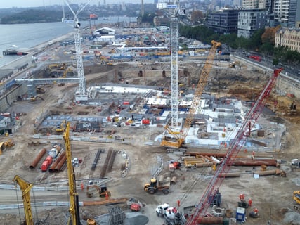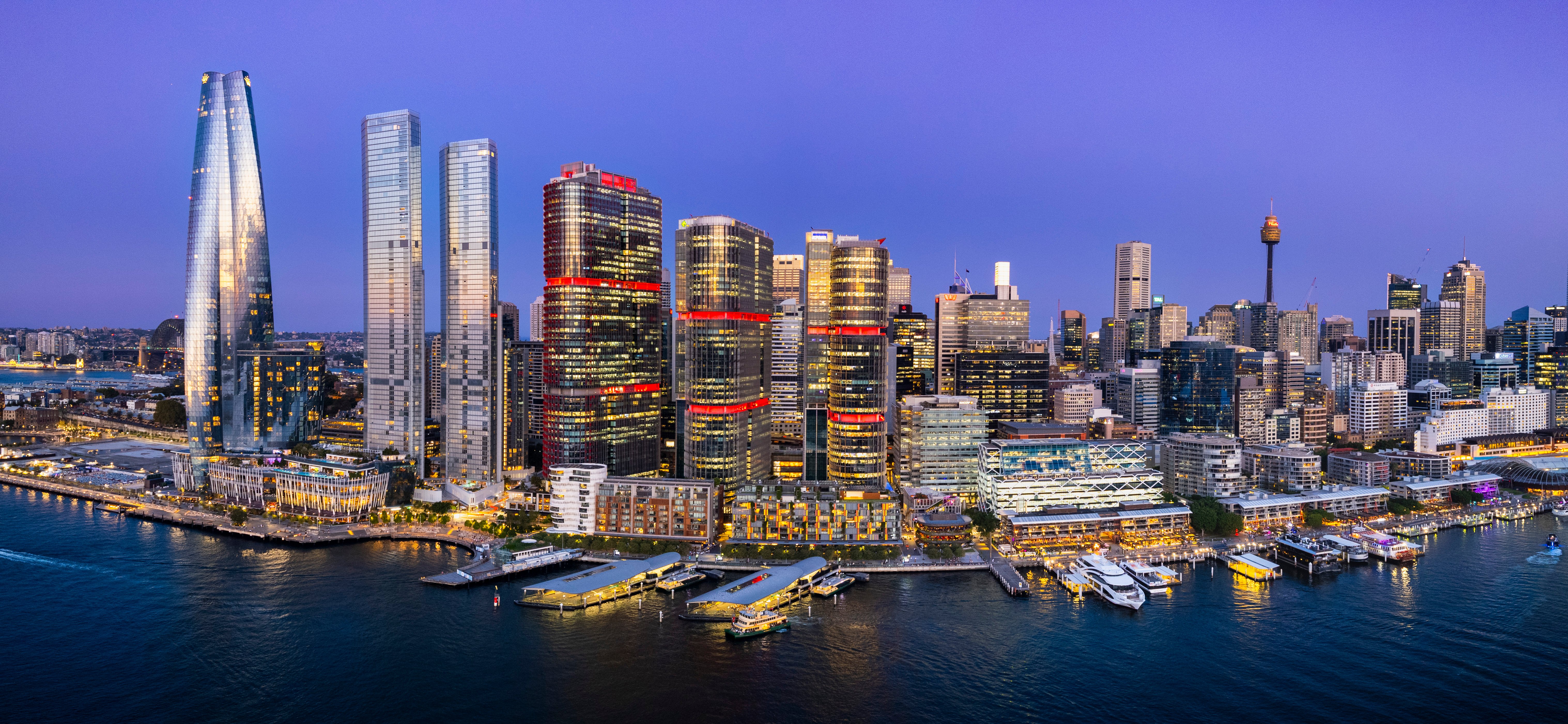
It’s been a decade since International Towers welcomed its first tenant partners to what was soon to become one of Australia’s most progressive and desirable workplaces. To anchor our journey of reflection and celebration over the next twelve months, we’ve developed a special brand identity.
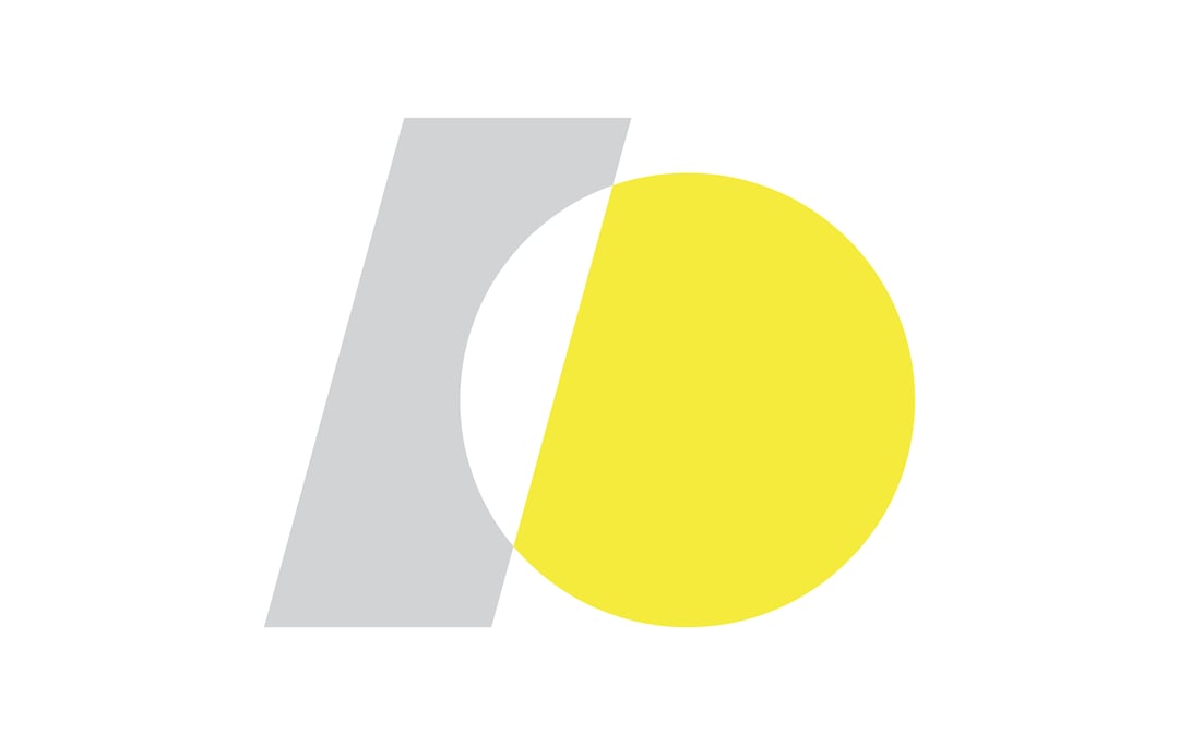
The symbol is a highly stylised representation of the number 10. The number 1 is skewed at an angle of 15 degrees – the exact angle between the central axis’ of Tower Two and Tower Three.
The two numbers intersect, forming a singular unit – representing the single, symbiotic community formed by our diverse population of people, organisations and visitors.
The colours used in the logo have been taken from the unique colours of the external solar fins of the towers, conceptualised by the architects of International Towers, Rogers Stirk Harbour: silver, representing the reflection of light on the harbour’s surface, and yellow, symbolising the sun and the extraordinary natural light that elevates our workspaces.
As a community, we have a lot to be proud of, and our anniversary gives us a wonderful opportunity to reflect on the many ingredients that make International Towers such a special place.